Опубликовано пт, 16/02/2018 - 08:13
"Нью-Йорк Таймс" предложил свои читателям придумать логотип для команды "Олимпийские атлеты из России" и для "Объединенной команды Северной и Южной Кореи". Тема политизированности Олимпийских игр, зависимости Международного олимпийского комитета от спонсоров и стейкхолдеров из Соединенных Штатов Америки продолжает оставаться в числе самых дискуссионных тем на страницах международной прессы. Посмотрите, что рисуют читатели уважаемого издания.
As punishment for an elaborate doping scheme, athletes from Russia competing at the 2018 Winter Olympics are wearing neutral uniforms. And for the first time, North and South Korea marched together at the opening ceremony, under a unified flag. Both could have used better designs, so we asked you, our readers, to come up with a new Russian logo and a united flag for the two Koreas. Here’s what you designed.
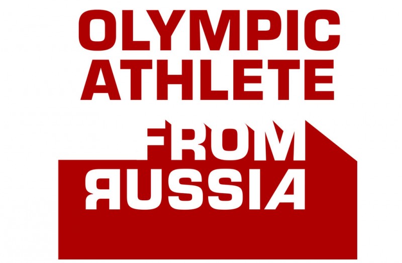
Olympic Athlete From Russia
Image
CreditElan Fleisher
BERLIN
Elan Fleisher, 57
“‘Russia’ is written as ‘Россия’ in Cyrillic. The three rounded forms in the Cyrillic letters served as the three uppermost Olympic rings in this logo. In the Olympic symbol, the outermost rings are blue and red, which I extended into the added letterforms. Those colors, along with white, are the colors of the flag of Russia.”
Image

CreditNick Pilgrim
MELBOURNE
Nick Pilgrim
“Given the drama and politics seemingly attached to every Olympics, I thought it would be fun to design a few ideas for the Russia logo that incorporate the Olympic rings in a playful yet subversive way.”
Image

CreditNick Pilgrim
Image

CreditLizzy de Sousa
CAPE TOWN
Lizzy de Sousa, 31
“I chose the golden eagles as base element and color because they’re strongly associated with the Russian Federation and reminiscent of the Russian coat of arms. The red crown and accents are a display of power and passion. The three panels of the wing symbolize tracks, and the three targets of bronze, silver and gold to be achieved, with the largest of the three, first place, highlighted in red.”
Image

CreditMinh Dan
HO CHI MINH CITY, VIETNAM
Minh Dan, 27
“Blue and red are reflected in the Olympic rings, but they’re also two colors in the Russian flag. The design and colors stemmed from the idea that although Russia has been punished for an elaborate doping scheme, it is still part of the Olympics.”
Image

CreditMinh Dan
Image

CreditJohn Cinco
STATEN ISLAND
John Cinco, 54
“Setting the alignment of the white text to the right, editing the shape of the ‘A,’ and reversing the ‘R’ to connote Cyrillic writing, all create a right-pointing red arrow shape in the background that can allude to speed, movement and progress.”
You have 4 free articles remaining.
Image

CreditMike Perushek
MAPLE GROVE, MINN.
Mike Perushek, 61
“It’s a twist on the flag of the Soviet Union. Now a syringe and sickle.”
Image

CreditOlga Merkulova
KLAIPEDA, LITHUANIA
Olga Merkulova, 32
“The idea behind the design is that the Russian team, after having been cleared of doping violations, embodies the purity of Lake Baikal, which is in southern Siberia and is one of the cleanest in the world.”
Image

CreditVladimir Doychinov
DORSET, ENGLAND
Vladimir Doychinov, 59
“The colors and design are triggered by my emotions for what’s happening in Russia —violence against free thinking, speaking out and a normal way of life.”
Image

CreditDavid Pham
SAN JOSE, CALIF.
David Pham, 32
“My logo is a nod to the Olympic rings logo. The words represent the upper right ring of the original logo and corresponds to the geographical location of Russia on a world map. The logo is intentionally void of any flag colors or national symbolism from Russia.”
Image

CreditBrandon Romanchuk
TORONTO
Brandon Romanchuk, 26
“I like the badge-style approach to this logo because it symbolizes authority and power, showcasing the talents and ‘power’ that Russia is able to bring to the Olympics.”
Image

CreditMoisuc Vlad
TARGU FRUMOS, ROMANIA
Moisuc Vlad, 18
“The logo is based on the principle of the official Olympic rings, which illustrates togetherness. The interlocking squares represent different parts of Russia, different athletes and different teams as a whole. I used squares instead of circles to show that Russians are distinctive and to highlight their unique contribution to the Olympic Games.”
Image

CreditRocky Gonzales
MANILA, PHILIPPINES
Rocky Gonzales
“I got my inspiration from St. Basil’s Cathedral, which has these multicolored, swirly, cone-shaped roofs. The torch symbolizes life, hope, truth and the regenerative power of flame. The torch must be able to stand up to challenging weather conditions, just like the athletes who are here to overcome challenges. The rings around the torch express the unification and solidarity.”
Korean Unification Flag
Image

CreditRafael Ramires and Anna Lara Cardoso
FOZ DO IGUACU, BRAZIL
Rafael Ramires, 36, and Anna Lara Cardoso, 22
“The trigrams on the South Korea flag were translated into an eight-point star, representing the full spectrum of a united fraternity of North Korea and South Korea athletes. The star on the North Korean flag was placed inside as a symbol of embracement and hospitality from the South Korea delegation. The central curve of the yin and yang bisects the star.”
Image

CreditHamidreza Abbassmovahedi
HOLLISTER, CALIF.
Hamidreza Abbassmovahedi, 49
“Korea, written in Korean, is 대한민국. The character, 한, isolated from the other characters, means one. Hence the number one, as a symbol of unity with its color harmonized with the modified emblem of the Joseon dynasty, which lasted for around five centuries and left a big impression on modern Korean culture, etiquette, norms and current societal attitudes. It’s something that, in my humble opinion, all Korean people can stand behind.”
Image

CreditJohnson Cheng
HONOLULU
Johnson Cheng, 44
“The nuclear logo in the color of the Olympic rings is in reference to the nuclear capability of North Korea and its proximity to the site of the Winter Games. The large blue ball is the color of the unification team of North and South Korea. The white-blue-red ball symbolizes Russia spinning off from the Olympic ring. I hope Russia will be back in orbit and reinstated into the summer Olympics.”
Image

CreditKan Moji
LONDON
Kan Moji, 30
“The South Korean flag (above) is derived from the yin and yang symbol, but it missing two dots. By adding the “stars” from North Korean flag as the two dots, the missing has been found. For the other design (below), the star symbol on North Korea’s flag mostly represents communism. If that star is existed on a unified flag for both countries, South Koreans may not like it because that’s not their government. Replacing the star symbol with South Korea’s symbol would make both nations happy.”
Image

CreditKan Moji
Image

CreditAvtar Singh
NEW YORK
Avtar Singh, 22
“I used key components of both flags in the design, reversing the colors of both nations’ flags. I made North Korea’s red star in the center of the flag and added a giant yin and yang surrounding it to show the balance and peace of the North and South. I added a white stripe between the yin and yang and around the star to show neutrality (and a small divide that may exist). The trigrams represent harmony of the yin and yang in all directions.”
Image

Compiled by Sona Patel and Jessica White
Feb. 15, 2018https://www.nytimes.com/2018/02/15/sports/olympics/alternate-olympic-log...